May 20, 2026
How to Build a Shopify Swatch System for Variants and Linked Products
A practical Shopify swatch workflow for variants, linked products, and collection pages with no code.

How to Build a Shopify Swatch System for Variants and Linked Products
If your store sells the same item in multiple colors, or splits a single product family across separate product pages, the default dropdown selector slows shoppers down. Supra Swatch Colors gives you one no-code setup for variant swatches, linked-product swatches, and collection-page swatches. The app listing is here: Supra Swatch Colors on Shopify, and the product site is here: supra-swatch-colors.sktch.io. If you want to see the setup flow first, the walkthrough video is Supra Swatch Colors - Getting Started - Tutorial.
1. Decide Which Swatch Model You Need
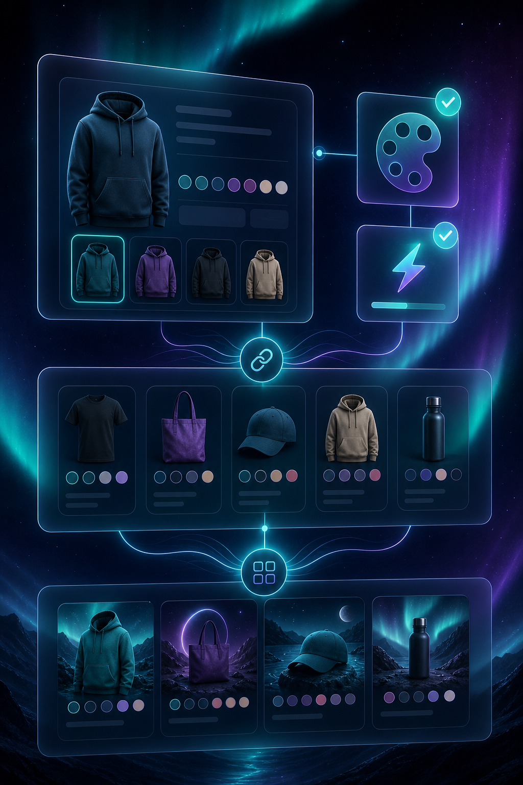
Start by deciding whether each color choice should stay inside one product or point to a separate product page. That is the key distinction in Supra Swatch Colors: you can turn built-in variants into swatches, or link separate products with swatches when the catalog is better organized that way.
Use variant swatches when the customer is choosing among colors, finishes, or sizes on one product. Use linked-product swatches when each color deserves its own page, its own description, or its own merchandising rule. The app also supports product groupings, so you can keep related items together instead of rebuilding the structure by hand.
Expected result: every swatch in the store has a job, and you know whether it maps to a variant or a separate product.
2. Pull Colors From The Catalog Instead Of Rebuilding Them
Once the structure is clear, use the app to populate swatches from what already exists in the catalog. Supra Swatch Colors can auto-detect colors used in your store, or you can use product images to set up swatches more quickly. That saves time when you are working through a long product list or a large collection.
If you are building image swatches, keep the images simple and recognizable. If you are building color swatches, keep the palette consistent with the product itself. The app supports both color and image swatches, so you can choose the representation that makes the most sense for each product family.
If you want a second walkthrough, How to Link Shopify Products with Color Swatches is the most relevant companion video.
Expected result: the swatch set reflects the real catalog instead of a manually retyped list.
3. Turn On Collection Page Swatches
The biggest usability gain usually shows up on collection pages. Supra Swatch Colors includes built-in collection page support, so shoppers can compare swatches before they open a product page. That matters when a collection has many color variants and the customer wants to scan quickly.
This is especially useful for a store that sells the same style in multiple finishes or sizes. Instead of opening every card, the shopper can use the collection grid as the first filter.
Expected result: collection pages become faster to browse and the color choice is visible earlier in the journey.

4. Match The Style To The Brand
Supra Swatch Colors offers 20+ customizable styles, which is more useful than it sounds if you care about visual consistency. You can match the tooltip, label, swatch size, and other details to the rest of the storefront. Use that flexibility carefully: the goal is not to showcase every setting, but to make the swatch feel native to the theme.
This is also where image swatches and color swatches can diverge. A minimal brand may want tight circles and a restrained tooltip. A catalog with bold product photography may want image swatches that feel more tactile. Keep the same rule across a collection so the customer does not have to re-learn the interface on every product page.
Expected result: the swatches look intentional instead of generic.

5. Test The Theme On Mobile And Desktop
The app is designed to work with all Shopify themes, and it loads instantly, but I still recommend checking both mobile and desktop before you roll the setup across the full catalog. Test a product page and a collection page. Confirm the swatches fit the card width, the tooltip is readable, and the selected state is obvious enough on a small screen.
If the store is multilingual, verify the labels and grouping names in each language. Supra Swatch Colors supports multilingual shops, so the last step is usually a content check rather than a technical one.
Expected result: the selector behaves consistently on the devices and languages your customers actually use.
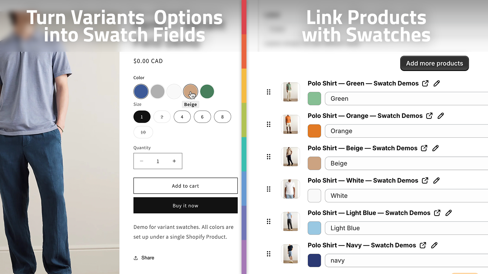
6. Use Linked Products When Variants Stop Being Enough
Linked-product swatches are the right move when one product page no longer tells the full story. If the colors or finishes need separate photography, separate descriptions, or separate merchandising, connect them with swatches instead of forcing everything into one variant block. That keeps the catalog cleaner and makes the browsing path more direct.
This is also the point where product grouping pays off. You can keep one family together, give each page the right context, and still let the shopper move between options without losing momentum.
Expected result: related products stay connected without turning the product page into a cluttered variant list.
Related Guides
If you want to keep working through the same Shopify problem space, these recent guides fit well with this setup:
- How to Add Color Swatches to Shopify Collection Pages Without Code
- How to Turn Shopify Variants Into Brand-Matched Swatches
- How to Build a Product-Aware Shopify Blog Workflow That Publishes on Schedule
- How to Bulk Edit Shopify Products and Variants Safely
Conclusion
If you want one setup that handles variants, linked products, and collection pages without touching theme code, Supra Swatch Colors is built for that job. Start with the app listing, map one product family first, and verify the result on both the product page and the collection page before you expand it across the store.
Install Supra Swatch Colors on Shopify and test one product family this week.