
July 10, 2026
How to Roll Out Shopify Swatches Without Touching Theme Code
Set up Shopify color and image swatches for variants, linked products, and collection pages without touching theme code.

If your product pages still make shoppers click through dropdowns, Supra Swatch Colors gives you a cleaner path: turn variants into swatches, link separate products with swatches, and show the same system on collection pages without editing theme code. Start with the Shopify App Store listing for Supra Swatch Colors, then use the app site at supra-swatch-colors.sktch.io if you want a quick product overview.
If you want a broader setup pattern before you start, the companion guide How to Build a Shopify Swatch System for Variants and Linked Products is the right background read. For a tighter no-code implementation angle, How to Build a Cleaner Shopify Swatch System Without Theme Code shows the same problem from a different setup path.
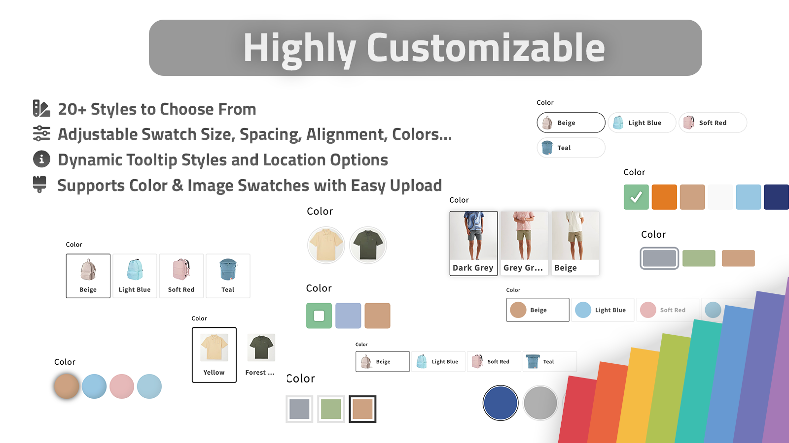
1. Decide What The Swatch Controls
Start by deciding whether a swatch should switch variants on one product page or move shoppers between separate product pages. That choice drives the rest of the setup.
Use variant swatches when the shopper is choosing a color, size, or finish within one product. Use linked-product swatches when each swatch should point to a separate product page, such as a different material, style, or bundle.
Expected result: you know whether each swatch maps to a Shopify variant or a linked product group before you touch styling.
2. Set Up One Product First
In Supra Swatch Colors, configure one hero product before you roll the same rules across the catalog. Keep the first pass small: one product group, one visual style, and one swatch type.
The app can auto-detect colors already used in your store or let you use product images for faster setup. It also supports 20+ customizable styles, so you can tune the tooltip, label, swatch size, and shape instead of forcing the store into a default look.

Expected result: the first product page shows swatches that match the catalog and still feel native to the theme.
3. Make The Product Page Easy To Scan
Once the first product works, check the product page on desktop and mobile. The point is not just to replace a dropdown. The point is to make the choice obvious at a glance.
That is where the product-page styling matters. Keep the swatch labels short, make sure the active state is obvious, and use image swatches only where the image actually helps the buyer decide. If the store already relies on strong product imagery, How to Build a Shopify Product Photo Workflow Without a New Shoot is a useful companion when you need consistent source images for swatches or alternate visuals.
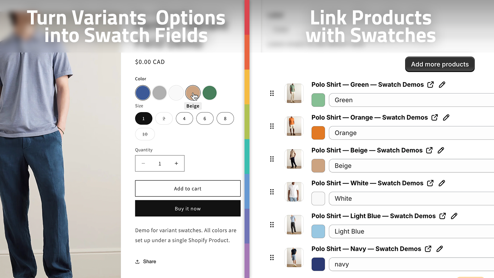
Expected result: shoppers can tell at a glance which option is active, and you do not need theme code to make the page readable.
4. Turn On Collection Pages
After the product page looks right, extend the same swatch logic to collection pages. Supra Swatch Colors supports collection pages built in, which matters because shoppers often browse from category grids before they ever open a product page.
Use this step to verify that the swatch system still makes sense when it is compressed into a grid card. If the collection page gets crowded, reduce the number of visible swatches and let the rest stay behind the product page.

Expected result: collection cards show the relevant options without overwhelming the grid or forcing a click-through for basic comparisons.
5. Scale Linked Products And Image Swatches
This is where the app becomes more than a styling layer. Linked-product swatches let you connect related products, while image swatches let you present a visual choice when color names are not enough.
The workflow below is what the setup should feel like once everything is connected: product data on the left, swatch rules in the middle, and a consistent storefront on the right. That same logic is why image-heavy catalogs often pair this app with How to Turn Plain Product Photos Into High-Converting Shopify Visuals when they want a tighter image pipeline for product art and swatch assets.
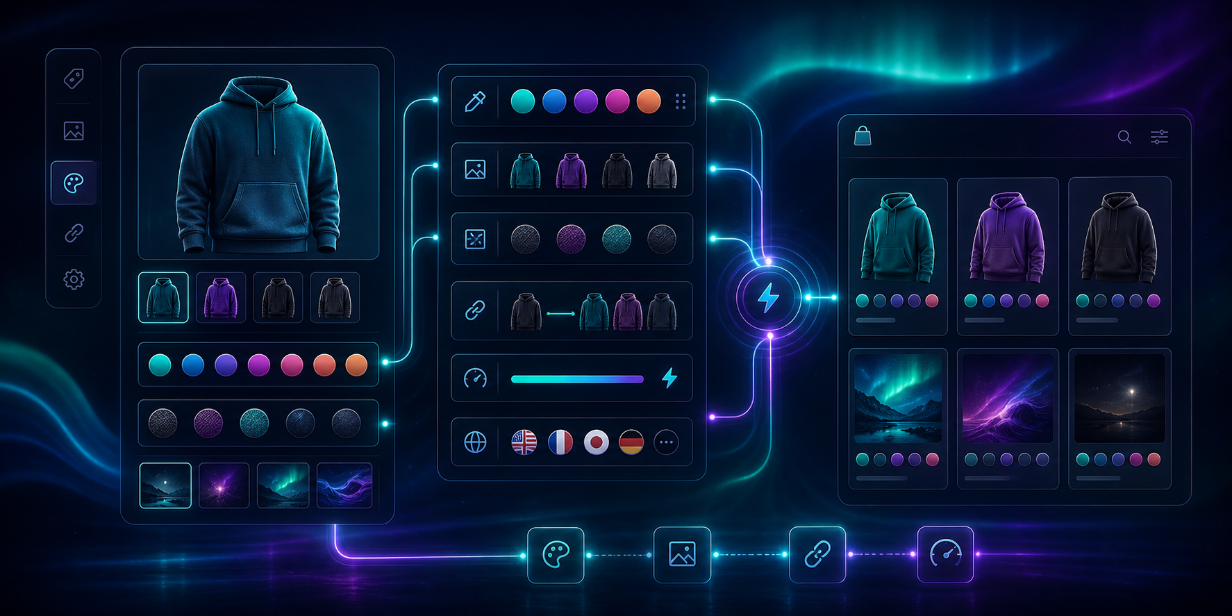
Expected result: shoppers can move between related products or variants without losing context, and the system still behaves consistently across the store.
Troubleshooting
If the swatches look inconsistent, check the three things that cause the most cleanup work:
- The color name in Shopify does not match the swatch label you expect.
- The product group is incomplete, so one variant or product is missing from the set.
- The collection page is showing too many options for the card size you picked.
If multilingual labels drift, keep the swatch naming source as close to the product data as possible. If the style feels crowded, reduce the swatch size before you remove useful information. If a buyer still cannot tell what changed, switch from color chips to image swatches for that specific product line.
For a quick visual walkthrough, the product videos are worth opening in order: Supra Swatch Colors — Getting Started — Tutorial and How to add Swatches on the Collection pages of your Shopify Store.
The Practical Result
The goal is a storefront that feels easier to browse without introducing theme code or a custom build. If you keep the first setup small, verify product-page behavior, and then expand to collection pages, the swatch system stays readable as the catalog grows.
Install Supra Swatch Colors, set up one product group, and use that first pass to decide whether the rest of the catalog should use variant swatches, linked-product swatches, or both.