
July 18, 2026
How to Set Up Shopify Swatches for Variants, Linked Products, and Collections
Set up Shopify swatches for variant colors, linked products, and collection pages without touching theme code.

If your catalog still forces shoppers through dropdowns, Supra Swatch Colors gives you a cleaner path: turn variant colors into swatches, link separate product pages with swatches, and show the same system on collection pages without code. I would start with the Shopify App Store listing for Supra Swatch Colors and keep the app site, supra-swatch-colors.sktch.io, open while you work.
If you want to see the setup before you touch the admin, the product videos are worth opening in order: Supra Swatch Colors - Getting Started - Tutorial and How to Link Shopify Products with Color Swatches. They map cleanly to the workflow below.
1. Decide What Each Swatch Should Do
The first choice is simple, but it controls everything else. Decide whether each swatch should stay on the current product as a variant choice or send the shopper to a separate product page as a linked-product choice.
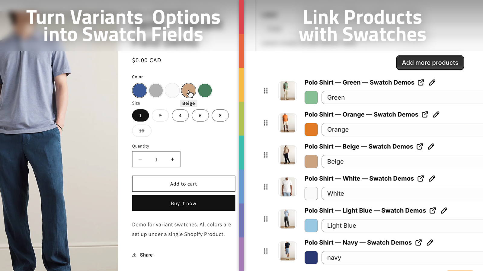
Use variant swatches when the shopper is choosing a color, finish, or other built-in option on one product. Use linked-product swatches when each swatch represents a different product page, such as a separate material, style, or product family.
Expected result: you know which catalog entries will use variant mapping and which ones will use product groupings before you touch styling.

2. Build The First Product Group
Start with one hero product instead of trying to roll out the whole catalog at once. In Supra Swatch Colors, set up one product group, confirm the swatch type, and let the app auto-detect colors when that is faster than typing them manually.
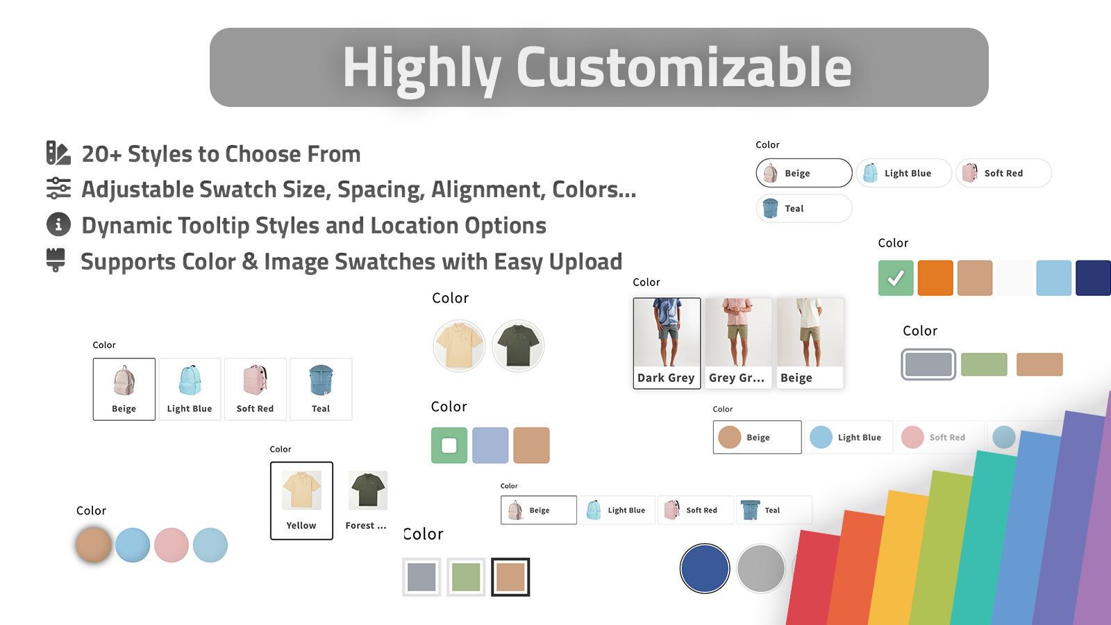
The app also supports using product images for swatches, which helps when the color name is not enough. Once the data is in place, pick one of the 20+ styles and tune the tooltip, label, swatch size, and shape so the swatches match the storefront instead of fighting it.
Expected result: one product page shows a swatch system that feels deliberate on desktop and mobile.
3. Make The Product Page Easy To Scan
Once the first product works, focus on readability. Keep labels short, make the active state obvious, and use image swatches only where the image actually helps the buyer decide.
If you are working across themes or locales, keep the source labels and swatch names stable before you scale. The related guide How I Keep Shopify Swatches Consistent Across Themes and Collections is useful here because the main failure mode is not the swatch itself. It is drifting naming, styling, or spacing between pages.
Expected result: shoppers can tell which option is active without hunting for the selected state.
4. Turn On Collection Pages
After the product page is stable, extend the same logic to collection pages. Supra Swatch Colors supports collection-page swatches out of the box, which matters because a lot of shoppers browse the grid long before they ever open a product page.
Use the collection page to reinforce, not repeat, the product page. If the tile is crowded, reduce the number of visible swatches and let the rest of the choice live on the product page. If the swatches are tiny, keep them simple. If the collection grid is image-heavy, the swatch row should stay visually light.
For a more visual setup path, How to Build a Shopify Product Photo Workflow Without a New Shoot and How I Turn Basic Shopify Product Photos Into Better Assets are both useful when you need better source images for swatches and related product visuals.
Expected result: collection browsing shows the right option context without turning the grid into noise.

5. Scale The Rules Across The Catalog
Once the first group works, repeat the same naming and style rules across the rest of the catalog. That is where linked-product swatches start to pay off: separate product pages can still feel like one system when the labels, active states, and spacing stay consistent.
If you want a lighter rollout path, How to Roll Out Shopify Swatches Without Touching Theme Code shows the same idea from a no-code implementation angle. It is a good companion if you want the swatches to live inside the existing storefront instead of becoming a one-off project.
Expected result: your catalog can grow without every product page becoming a fresh custom setup.

Troubleshooting
- If a swatch is missing, check whether the product belongs to the right group.
- If the color label looks wrong in another language, fix the source label before duplicating the setup.
- If collection cards feel busy, reduce the number of visible swatches before you change the style.
- If image swatches are unclear, switch that family back to solid color chips or linked-product swatches.
For a quick walkthrough, the product videos are useful in this order: Supra Swatch Colors - Getting Started - Tutorial, How to add Swatches on the Collection pages of your Shopify Store, and Supra Swatch Colors - Shopify App to add Color Swatches to Products.
The practical path is straightforward: set up one product, confirm the product page, turn on collection pages, and then copy the pattern to the rest of the catalog. If you want to follow that sequence in the app, install Supra Swatch Colors and wire up one product group first.