
August 5, 2026
How to Set Up Shopify Swatches for Product Families and Collection Pages
Set up Shopify swatches for product families, variants, linked products, and collection pages without theme code.

If your store sells colorways, finishes, or closely related product pages, the worst experience is a dropdown that makes shoppers guess. Supra Swatch Colors gives you a cleaner path: turn variants into swatches, link separate product pages, and show the same system on collection pages without touching theme code.
Start with the Shopify App Store listing if you want the install path first. If you want the broader decision framework before you configure anything, these recent guides are the right companions: How to Choose the Right Shopify Swatch Setup for Variants, Linked Products, and Collections, How to Roll Out Shopify Swatches Without Touching Theme Code, How I Build Shopify Swatches That Match the Theme, and How to Scale Shopify Swatches for Large, Multilingual Catalogs.
1. Decide What One Swatch Means
Before you open the app settings, decide whether each swatch should switch a variant on one product page or move the shopper to a different product page.
Use variant swatches when the options are truly the same product in different colors, sizes, or finishes. Use linked-product swatches when each choice should open a separate page, such as a different material, silhouette, or bundle.
That decision matters because it keeps your catalog logic clear. If a shopper clicks a swatch and the page changes, the store is telling them they are in a product family. If the page stays put and only the selection changes, the store is telling them they are still inside one product.
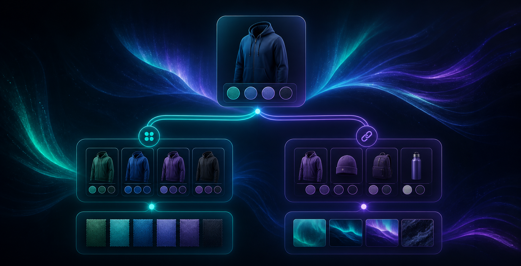
Expected result: every swatch has one job, and your team does not have to guess whether it should behave like a variant or a product link.
2. Configure One Product Family First
In Supra Swatch Colors, start with one hero product family instead of the whole catalog. That gives you a safe place to check the logic, the styling, and the wording before you scale the setup.
Use the app to auto-detect colors already used in the store, or pull from product images if that is faster for your catalog. Then tune the controls that matter most for the storefront: swatch size, tooltip, label, and visual style. The app supports 20+ customizable styles, so you can match the theme instead of forcing the theme to adapt to a default widget.
If your store is multilingual, keep the swatch names tied to the same product source you already translate elsewhere. That keeps labels consistent when you add more languages later.
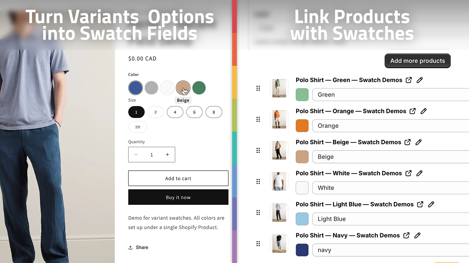
Expected result: one product family already looks native, and you can tell whether the swatch rules are mapping to variants or separate products the way you intended.
3. Check The Product Page On Desktop And Mobile
Once the first family is configured, open the product page on both desktop and mobile. The goal is not just to replace dropdowns. The goal is to make the choice obvious at a glance.
Keep the active state easy to see. Use image swatches where a color name is not enough to communicate the difference. Keep text labels short. If the swatch row starts to feel crowded, reduce the size before you start removing useful information.
This is also the right moment to compare the visual rhythm against How I Build Shopify Swatches That Match the Theme. If the swatches feel like a plugin instead of part of the store, the size and spacing usually need another pass.
Expected result: a shopper can pick an option without stopping to decode the interface.
4. Turn On Collection Pages After The Product Page Works
Only extend the setup to collection pages after the product page is behaving well. Collection cards compress the same decision into a much smaller space, so the rules need to be stricter.
Supra Swatch Colors supports collection pages built in, which is useful because a lot of shoppers browse from category grids before they ever open a product page. Keep only the swatches that help people compare quickly, and let the product page carry the deeper detail.
If you want a more no-code rollout pattern while you do this, How to Roll Out Shopify Swatches Without Touching Theme Code is a good companion read.

Expected result: collection cards show the relevant options without turning the grid into visual noise.
5. Scale Linked Products And Image Swatches
This is where the setup becomes a merchandising system instead of a styling tweak. Linked-product swatches let you connect related product pages, and image swatches let you use a real visual cue when color names are too abstract.
That combination matters most when your catalog is larger, your product families have several branches, or your store has more than one language. The same app workflow can hold the catalog together without forcing each category to invent its own rules.
The broader scaling pattern is similar to How to Scale Shopify Swatches for Large, Multilingual Catalogs: keep the structure consistent, make the display readable, and let the product data drive the display instead of the other way around.
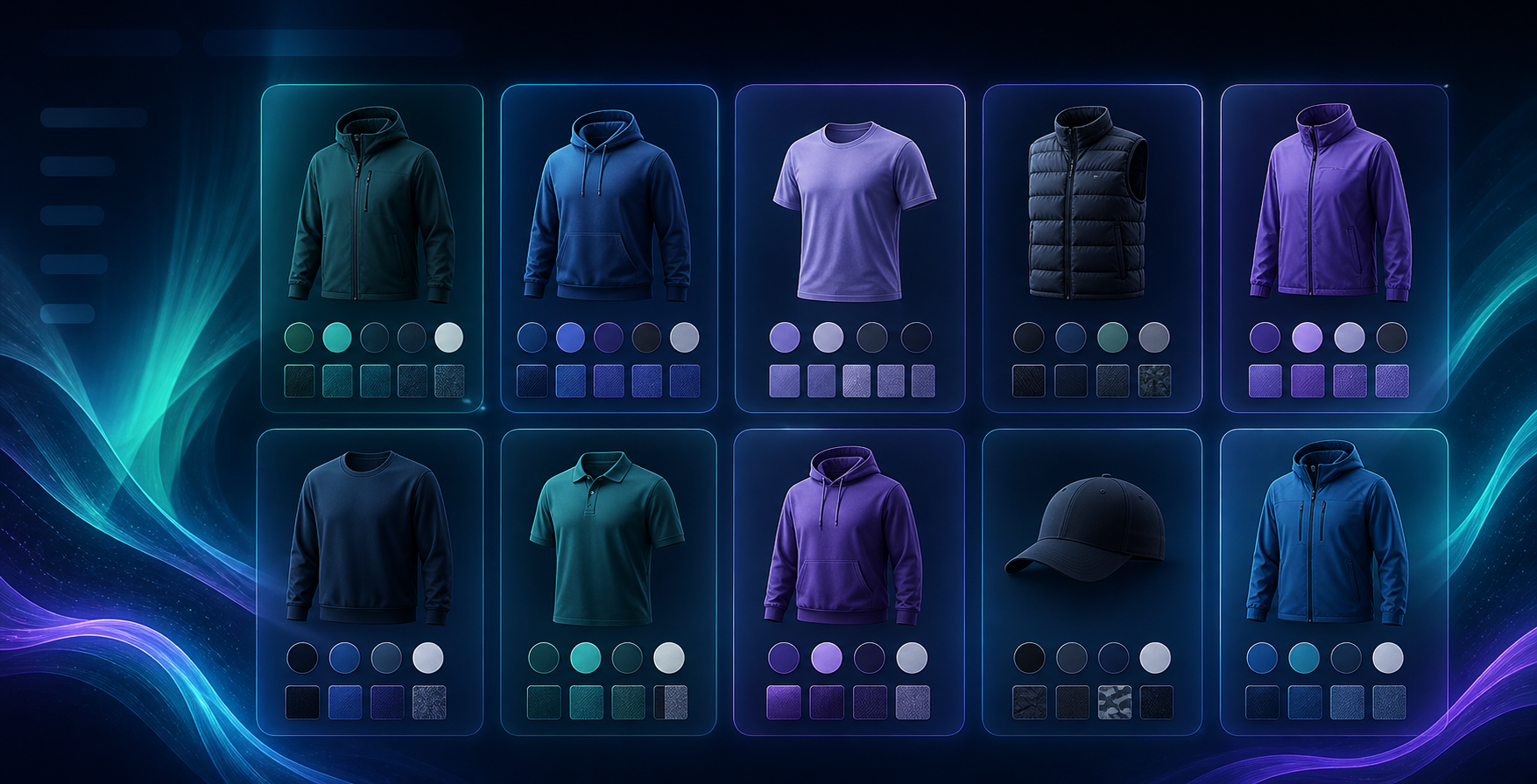
Expected result: shoppers can move between related products or compare variants without losing context.
Troubleshooting
- If the swatch labels do not match the colors you expected, check the naming source in Shopify before changing the visual style.
- If a linked product is missing from the set, look for an incomplete product group before you assume the widget is broken.
- If the collection page feels crowded, lower the visible swatch count or the swatch size before you remove the option entirely.
- If translations drift, keep the swatch text tied to the same product data source you use elsewhere in the catalog.
For a quick walkthrough, the product video Supra Swatch Colors — Getting Started — Tutorial is useful when you want to watch the setup instead of reading it.
The Practical Result
The shortest path is simple: install Supra Swatch Colors, configure one product family, verify the product page, then extend the same logic to collection pages and related products.
If you want the product overview first, the app site at supra-swatch-colors.sktch.io is the quickest place to check the feature set. Once the first family is stable, copy the pattern across the catalog and keep the swatch rules tied to the way shoppers actually browse.